Table of Contents
Introduction
Exploratory Data Analysis (EDA) is the most fundamental and very important step in data science and machine learning. Before we build any machine learning model or present business insights we need to understand the behavior of our data. That is where EDA comes into play.
In this article you will learn all the fundamentals and theory you need to have on Exploratory Data Analysis (EDA) with real world examples. Whether you are working on a machine learning model or just starting your data science journey this skill will help you to make better decisions and build cleaner models by avoiding costly mistakes.
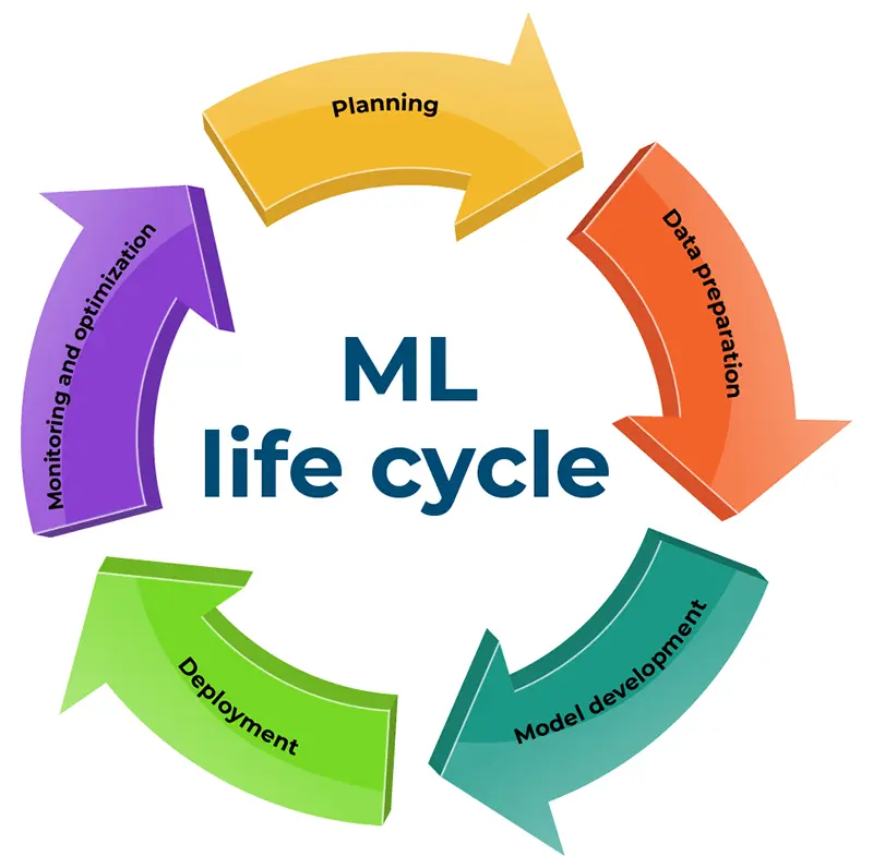
In the machine learning life cycle EDA comes in the key stage of data preparation. No matter how good is our model it will be wasted if we train our model on some weak garbage data. So to obtain more clean and strong data we need to analyze the data we have.
If data analysis is “cooking the meal and serving it base on a recipe EDA is like “looking around the kitchen and tasting ingredients”. Simply it means Exploratory Data Analysis (EDA) is the initial step of Data Analysis. Therefore it is important to gain a solid understanding of What is EDA and the best practices you can use to optimize the data preparation stage in the Machine Learning life cycle.
What is EDA ?
Exploratory Data Analysis (EDA) is an approach to analyzing data that combines visualization and statistical tools to:
- Recognize the properties and structures of data.
- Find trends, understand patterns, irregularities(anomalies), and relationships between data.
- Create hypotheses and test presumptions.
- Help with feature engineering and modeling choices.
EDA ensures high-quality data inputs for predictive models by bridging the gap between sophisticated machine learning and raw data collection.
Why is EDA so important ?
- It helps to understand the dataset by showing how many features it has, what type of data each feature contains and how the data is distributed.
- It helps to identify hidden patterns and relationships between different data points which help us in and model building.
- Allows to identify errors or unusual data points (outliers) that could affect our results.
- The insights gained from EDA help us to identify most important features for building models and guide us on how to prepare them for better performance.
- By understanding the data it helps us in choosing best modeling techniques and adjusting them for better results.
Types of Data
When we try to EDA we have to deal with a lot of data. These data can be categorized into two main types, they are categorical data (qualitative) and Numerical Data (Quantitative). Let’s see the real world example for these types of data.
Categorical Data
Categorical data can be put into groups or categories using names or labels. These data also known as qualitative data may be assigned to only one category based on its qualities and each category is mutually exclusive. There are two types of categorical data :
- Nominal Data : Categorical data with no inherent order or ranking. Examples include colors (red, blue, green), or types of fruit (apple, banana, orange)
- Ordinal Data : Categorical data with a meaningful order or ranking. Examples include education level, customer satisfaction which includes responses like “Very good” , “good” , “bad” and “very bad”.
Numerical Data
Data expressed in numerical terms rather than in natural language descriptions are called numerical data. It can only be gathered in numerical form, keeping its name. This numerical data type also referred to as quantitative data. There are two types of Numerical data :
- Discrete Data: Countable numerical data are discrete data. Age, the number of students in a class, the number of candidates in an election, are a few examples of discrete data in general.
- Continuous Data: This is an uncountable data type for numbers. These data however can be measurable. Student GPA, height, income and other continuous data types are a few examples.

Steps of EDA Workflow
Understanding the Problem & Dataset
The first step in any exploratory data analysis is to fully understand the business problem we’re solving and the data we have. This includes asking key questions like:
- What is the business goal or research question?
- What are the variables in the data and what do they represent?
- What types of data (numerical, categorical, text, etc.) do you have?
- Are there any known data quality issues or limitations?
- Are there any domain-specific concerns or restrictions?
By understanding the problem and the data, we can plan our analysis more effectively, avoid incorrect assumptions and ensure accurate conclusions.
Data Sourcing
After understanding the business problem and data we have to identify and access the relevant data sources. There are many types of data sources we can find in the real world. Following are some of those types :
- Internal : Customer support, web analytics, transaction logs.
- External : APIs, Government datasets, purchased data.
- Structured : Databases, CSV files, Excel spreadsheets.
- Unstructured : Text, images, audio, social media
It’s important to find data to gain an basic understanding of its structure, variable types and any potential issues. Here’s what we can do:
- Load the data into our environment carefully to avoid errors or truncations.
- Check the size of the data like number of rows and columns to understand its complexity.
- Check for missing values and see how they are distributed across variables since missing data can impact the quality of your analysis.
- Identify data types for each variable like numerical, categorical, etc which will help in the next steps of data manipulation and analysis.
Data Cleaning
After identifying and accessing the relevant data sources we need to clean the data. Most of the time what we get is weak , unstructured raw dataset with these type of data sets we cannot move to modeling. Therefore it is important to Clean the raw data. We should always ask questions during cleaning such as Are the data types correct for each column? Are the values within expected ranges? and more. Following techniques can be used for this purpose:
Handling Missing Values
Missing data is so common in many datasets. We have to identify and handle missing data properly to avoid biased or misleading results. Missing data can be identified as NULL, NaN, empty strings or special values like -999. We can address these issues using following options:
- Deletion : Drops rows or columns with high missing values
- Simple imputation : Replace with mean or median or mode.
- Advanced Imputation : KNN, regression models or MICE for preserving relationships
- Flagging : Create binary indicators to mark imputed values
Outlier Detection
Outliers are data points that differs from the rest of the data may caused by errors in measurement or data entry. We can identify these outliers using following techniques:
- Z- score : |z| > 3 standard deviations
- IQR method : x < Quantile 1 – 1.5*IQR or x > Quantile 3 + 1.5 * IQR (IQR = Quantile 3 – Quantile 1)
- Visual plots : By analyzing plots like box plots, histograms, scatter plots and more.
- Machine Learning : Isolation Forest, DBSCAN clustering, Local outlier factor
To handle these outliers and if needed to get rid of them we can use several strategies. Some of them are listed below:
- Retain : Keep outlies if they represent valid special cases.
- Remove : Delete outliers after confirming they are data errors.
- Transformation : Apply transformations to normalize distribution
- Separate : Create separate models for outliers
- Cap : Winsorizing by replacing percentile boundaries,
Handle Invalid Values
Negative values in positive fields, text in numeric fields, inconsistent units, future dates in historical data : These are some of the common invalid data we can find in a dataset. We cannot move forward with these types of invalid data. Therefore in order to get rid of invalid data we use some strategies like:
- Data type conversion : Force appropriate types with validation.
- Range Enforcement : Clip values to valid domain- specific bounds.
- Standardization : Convert all values to consistent formats.
- Flagging : Mark suspicious values for review.

Exploratory Analysis
Univariate analysis
Univariate analysis is the simplest form of analyzing data. “Uni” means “one”, so in other words your data has only one variable. It doesn’t deal with causes or relationships and it’s major purpose is to describe; It takes data, summarizes that data and finds patterns in the data.
Common techniques include Central Tendency which measures such as mean, median and mode to represent the central value of the data, Dispersion which measures like range, variance and standard deviation to show the spread or variability of the data and more.
We can represent the distribution and overall pattern of the variable by using visualization methods like Histogram , boxplot, etc. for numerical data and bar charts , pie charts, etc. for categorical data and line chart, seasonal decomposition for time series data.
Bivariate analysis
Bivariate analysis is the another form of analyzing data. “Bi” means “two”, so in other words your data has two variables. It helps uncover correlations and associations between different factors in data analysis which cannot be found when examine variables in isolation. There are three main types of Bivariate analysis
- Numerical – Numerical : We can use scatter plots and hexbin plots for high density data.
- Numerical – Categorical : We can use box plots and bar charts with error bars to compare distributions.
- Categorical – Categorical : We can use contingency tables and heatmaps to visualize distributions.
Multivariate analysis
Multivariate analysis is a powerful statistical method that examines multiple variables to understand their impact on a specific outcome. This technique is crucial for analyzing complex data sets and uncovering hidden patterns across diverse fields such as weather forecasting, marketing, and healthcare. Following are some of the techniques of multivariate analysis:
- Correlation Matrix : Identify relationships between all variable parts.
- Partial Correlation : Control for confounding variables
- Dimensionality reduction : PCA, UMAP
- Conditional Analysis : Examine relationship with subgroups.
- ANOVA : compare means across multiple groups.
We can use heatmaps, pair plots, parallel coordinates, 3d plots and face grids to visualize these multivariate analysis.

Feature Engineering
Feature engineering is the process of turning raw data into useful features that help improve the performance of machine learning models. It includes choosing, creating and adjusting data attributes to make the model’s predictions more accurate. The goal is to make the model better by providing relevant and easy-to-understand information.
Derived Features
Derived metrics are essentially new columns created from existing ones. Instead of using raw data directly, you transform it to create features that are more informative or relevant to the problem you’re trying to solve. Examples of Derived Metrics:
- Ratios: Dividing one feature by another (e.g.,
radius_texture_ratioin the breast cancer dataset). - Interactions: Multiplying two or more features together (e.g., combining price and quantity for a total cost).
- Polynomial Features: Raising features to a power (e.g., squaring a feature to capture non-linear relationships).
- Aggregations: Applying functions like sum, average, or maximum to groups of data (e.g., calculating the average order value for each customer).
- Domain-Specific Calculations: Creating metrics based on expert knowledge or specific business logic (e.g., calculating BMI from height and weight).
Feature Binning
Feature binning, also known as data binning or bucketing, is a data preprocessing technique used to group continuous numerical features into discrete bins or categories. Some of the methods used in feature binning are :
- Equal Width : Divide range into equal sized intervals (ex: Age 20-30, 30-40, 40-50, etc.)
- Equal Frequency : Create bins with equal number of observations (ex: income percentiles 0 -25%, 25-50%, etc.)
- Domain-Based : Use business knowledge to create meaningful groups (ex: = Age groups – Child, Teen, Adult, etc.)
We can have multiple benefits by using feature binning some of them are :
- Handles non-linear relationships.
- Reduces impact of outliers.
- Creates interpretable features.
- Handles missing values (as separate bin).
- Can improve model performance for tree-based models.

Feature Encoding
Feature encoding is the process of transforming categorical features into numeric features. This is necessary because machine learning algorithms can only handle numeric features. There are many different ways to encode categorical features, and each method has its own advantages and disadvantages. Some of those encoding techniques are listed below:
- Label Encoding : Assigns integer to each category (0, 1, 2…) Best for Ordinal data.
- One-Hot Encoding : Creates binary columns for each category Best for Nominal data with few categories.
- Target Encoding : Replaces category with target mean Best for High cardinality predictive features.
- Binary Encoding : Represents integers as binary code Best for High cardinality with limited memory.
- Frequency Encoding : Replaces category with its frequency best for when frequency matters.
Feature Scaling (Standardization)
Feature scaling is a preprocessing step in EDA where you adjust the numerical features of a dataset to a consistent scale. This ensures that no single feature dominates the model’s learning process due to its larger magnitude. Some of the Scaling methods are listed below:
- Min-Max Scaling : Scales values to [0,1] range x’ = (x – min) / (max – min)
- Standardization : Centers at mean=0, std=1 x’ = (x – μ) / σ
- Robust Scaling : Uses median and IQR instead of mean/std x’ = (x – median) / IQR
- Long Transform : Uses median and IQR instead of mean/std x’ = (x – median) / IQR
Visualization in EDA
Data Visualization represents the text or numerical data in a visual format, which makes it easy to grasp the information the data express. We, humans, remember the pictures more easily than readable text, so Python provides us various libraries for data visualization like matplotlib, seaborn, plotly, etc. There are three main types of visualization plot types :
- Distribution Plots : Histograms, density plots, and box plots reveal data shape, central tendency, and spread.
- Relationship plots : Scatter plots, pair plots, and correlation heatmaps visualize connections between variables.
- Temporal plots : Line charts, area charts, and calendar heatmaps display patterns over time.

Class Imbalance & Target Analysis
Understanding the distribution of your target variable is one of the most crucial aspects of EDA, particularly when dealing with classification challenges like fraud or churn prediction. One class (such as “Not Churned”) occurs far more frequently than the other (such as “Churned”) in many real-world datasets. We refer to this as class imbalance.
When your data is imbalanced:
- Your model may mostly predict the majority class and still get a high accuracy but it’s not actually useful.
- Rare but important cases (like churners or fraudsters) can get ignored.
- Standard accuracy becomes misleading.
In this step, we:
- Check how balanced the target variable is.
- Look at how the target behaves across different groups (e.g., by gender, age, region).
- Explore changes over time (e.g., does churn increase in a certain month?).
If we find an imbalance, we might need to use special techniques like resampling or focus on better metrics like F1-score or ROC-AUC. This helps us build models that are fair, accurate, and useful for the real-world problem we’re solving.
Feature Profiling
Categorical Features
In a dataset, categorical characteristics (such as product category, geography, or gender) frequently convey significant signals. We can better understand how each category acts and whether it might aid in the prediction of the target variable by profiling these features.
In this step, we focus on:
- Frequency Analysis – Count how often each category appears. This shows us which values are common and which are rare.
- Cardinality Assessment – Check how many unique values exist. Too many categories (high cardinality) can make modeling harder.
- Target Relationship – See how the target variable (like churn rate) varies across different categories. This helps identify strong predictors.
- Missing Value Patterns – Look for missing or null values in categorical columns and understand how often they occur.
To handle these we can use the following strategies :
- High Cardinality Group Rare Categories into an “Other” group to reduce noise.
- Combine Similar Values for sparse or redundant categories.
- Hierarchical Grouping when categories have a logical structure (e.g., Country → Region → Continent).
- Encoding strategy method (like one-hot or target encoding) based on the number of categories and their impact on the target.
You can increase your models’ interpretability and predictive ability by appropriately handling and profiling categorical features.
Numerical Features
Machine learning models frequently rely on numerical features, such as age, wealth, or score. During EDA, we conduct a thorough statistical analysis to fully comprehend them. There are many key metrics we need to examine her, some of them are :
- Central Tendency : How data values are centered (Mean, Median, Mode)
- Dispersion : How spread out the data is (Standard Deviation, Variance, Range, Interquartile Range (IQR))
- Shape : The distribution pattern of the data (Skewness (symmetry), Kurtosis (peakedness))
- Position : Where values fall within the dataset (Percentiles, Quartiles)
- Relationship Between Variables : (Correlation (linear relationship), Covariance)
These metrics aid in spotting patterns, identifying anomalous values, and directing choices about feature scaling transformation. Additionally, strong correlations may indicate multicollinearity or aid in feature prioritization for modeling.

Documenting and Communicating Your Findings
After finishing EDA, the dataset goes through a transformation journey – changing from messy, raw data into a clean and model-ready shape. By doing this, you can be sure that the features you feed into your machine learning model are dependable, significant, and performance-optimized. Those stages are listed below:
- Raw Data : The initial dataset, often messy with missing values, outliers, and inconsistent formats.
- Cleaned Data : Errors are fixed, missing values handled, and outliers addressed.
- Transformed Data : Features are scaled, encoded, and class imbalance is corrected.
- Engineered Data : New, insightful features are added, and irrelevant ones are removed.
- Model-Ready Data : The final, structured dataset is prepared for training machine learning models
Final documentation checklist
- A feature dictionary with clear definitions
- All transformation steps and why you applied them
- Before-and-after statistics (mean, std, missing values, etc.)
- Key EDA insights that influenced feature selection
- Any known limitations or assumptions
- Features expected to have high importance in the model
Effective communication is important to ensure that our EDA efforts make an impact and that stakeholders understand and act on our insights. By following these following steps and using the right tools, EDA helps in increasing the quality of our data, leading to more informed decisions and successful outcomes in any data-driven project.
- Clearly state the goals and scope of your analysis.
- Provide context and background to help others understand your approach.
- Use visualizations to support our findings and make them easier to understand.
- Highlight key insights, patterns or anomalies discovered.
- Mention any limitations or challenges faced during the analysis.
- Suggest next steps or areas that need further investigation.
Clear communication is equally as important to good EDA as analysis. Documenting your steps, ideas, and judgments makes your job easier to understand, replicate, and apply in subsequent stages, such as modeling or business reporting.
Conclusion
An essential component of any data science or machine learning workflow is exploratory data analysis, or EDA. Before beginning modeling, it helps you find hidden patterns, identify anomalies, test hypotheses, and develop an intuitive grasp of your data. Gaining proficiency in the EDA process, from data cleansing to visualization, paves the way for more precise and powerful models.
As you continue your data journey, remember: understanding your data deeply is what sets great analysts and data scientists apart.
Stay tuned with TechWiseAid as we dive deeper into EDA with hands-on project examples, practical walkthroughs, and real-world datasets to enhance your learning. There’s much more to come. So till then Explore, Learn and Thrive.